What IS Quibbly?
After spending time during an internship working on mobile applications with the UX and UI Designers at Google, I was raring to take all of what I learned and create something from scratch. Thus, Quibbly was born! The Idea behind Quibbly was to create an application that people could use to find info and cool facts about animals and nature and also watch documentaries. It’s secondary functionality would be to function as a sort of social hub where people could comment on articles and follow people and pages. The final functionality was for it to be tied to the kids version of the app, and the parents could monitor the child’s activities on the app and filter what the child sees and such. It would also allow for animal-loving families to share many awesome moments together!
After a few renditions, this was my favorite of the logos I created in all of it’s glory.
After I had an idea and a logo, it was time to start working on screens. I wanted to go for a clean and familiar design. The more familiar it is to users the easier they can pick it up and start using it right away. You will see what that translates to in the final images.
High Fidelity Screens

Login - Followed a universal trend for login screens and the result was this. I wanted to brand it more than jst with a logo so I added the animal backdrop to give it atmosphere and presence.

Create Account - For users to create an account if they do not already have one, following same principles from sign-in.

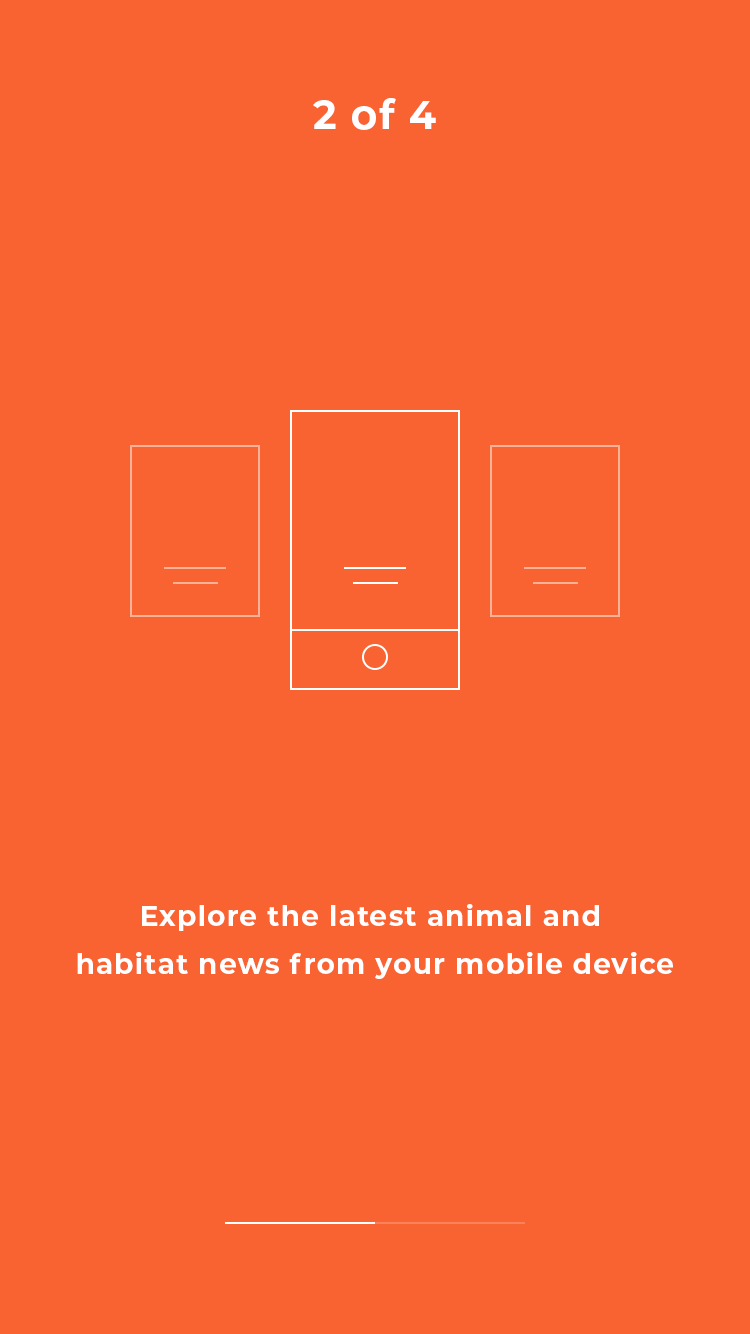
Walkthrough - I’ve noticed a very helpful trend that many applications use in order to “onboard” users and that is a quick slide show showcasing app functionality, therefore I decided to adopt this trend as well.

Home - Made the home screen have a partial “landing page” feel. Made it easy to scroll down to see all new things from pages the user is following.

Article Full - Shows the length of the story from beginning to end.

Article - This is how it will appear when a user clicks on a story to decide to read the full article. It will also show top comments on articles.

Comments - Followed ideals from popular social networking companies like Facebook and Twitter which set the gold standard for social media functions to come up with an easy to understand and navigate comment section.

Channels - Sections to see channels you follow, popular channels, and to search for new channels.

Channel - Shows cascading list of every post that a channel makes. Navigating by simply scrolling

Overview - Shows you percentage breakdown of what channels you’re following.

Calendar - Allows users to filter articles from a particular date range.

Timeline - We all know where it was referenced from. Shows you notifications from people in your “family” and people you follow and channels, etc.

Profile - Shows your comments, channels, bookmarked articles, etc.

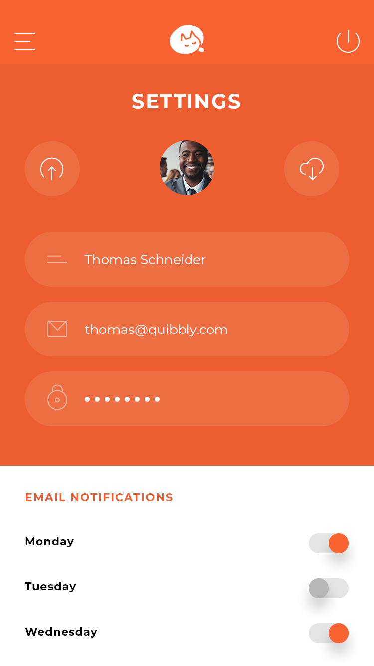
Settings - Settings that you’d expect to find. Can even set what days you get email notifications

Widgets - This section is customizable so you can have a bunch of different apps or trackers etc, it provides a sense of immersion, individuality, and cohesiveness all in one. In this screen, the user decided to have a weather app (maybe to see if the zoo was a possibility) and the population of two different endangered species.

My Family - This allows you to track what your children are doing in the app, also allows for you to send them articles and videos. More fun for the family!

Feedback - Got anything you wanna say to me? Love the app? Why not let me know! A channel for communication from consumers is a must.

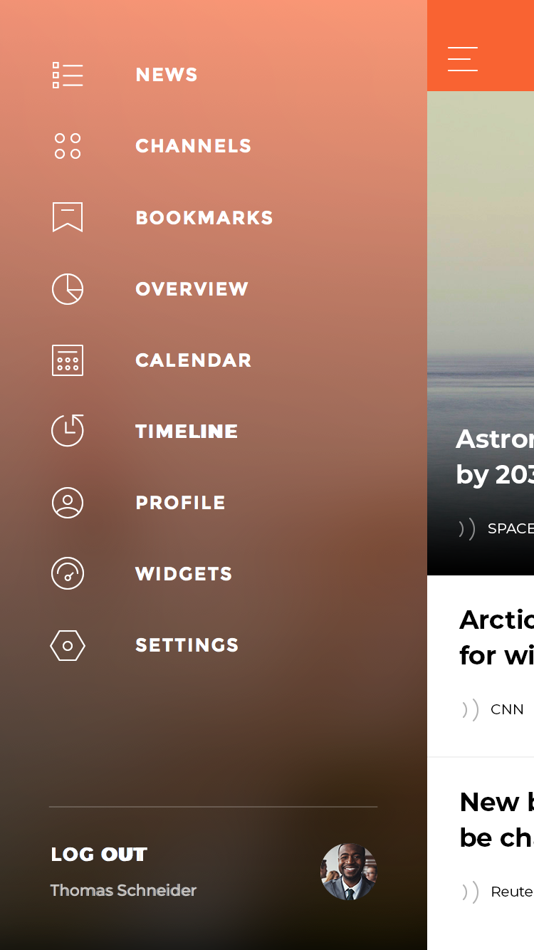
Navigation - Having a side panel navigation bar is a tried and tested way to allow users an easier way to navigate the application.


