Email Templates
Introduction
The email templates initiative was started as a part of the “User Engagement Loops” initiative, which refers to retaining more of the candidates and employers that we onboard.
Current State
As it currently stands, our emails are bland, uninviting, and do nothing to grab the attention of users. When designing it was a requirement to stay aligned with marketing when implementing branding.
Fullstory is an application that allows you to track user actions in your software and breaks down the usage data.
We used data from fullstory to track user habits and see how many of our emails were generating user engagement. To our dismay, there was only a 7% engagement rate, meaning only 7 out of 100 emails were actually clicked. (27% were opened)
Not visually appealing
Design inconsistencies
Has no clear call to action until reaching the bottom of the email
Doesn’t align with Stellarworx brand guide
Many of the actual emails do not provide value
After receiving the data from fullstory, I conducted an audit to determine all of the pain points/areas of improvement for our emails.
Email Template Audit
After the audit I began a competitive analysis to see what other job platforms were doing with their emails. I looked at many platforms but honed in on these three:


I took some guiding principles from the three email designs, and began to workshop some solutions in low fidelity white boarding. (My white board is black lol}
Scope Creep -
The phenomenon in which a team's initial plan—the scope of work it agreed to complete—slowly grows to include more goals, tasks, or requirements.
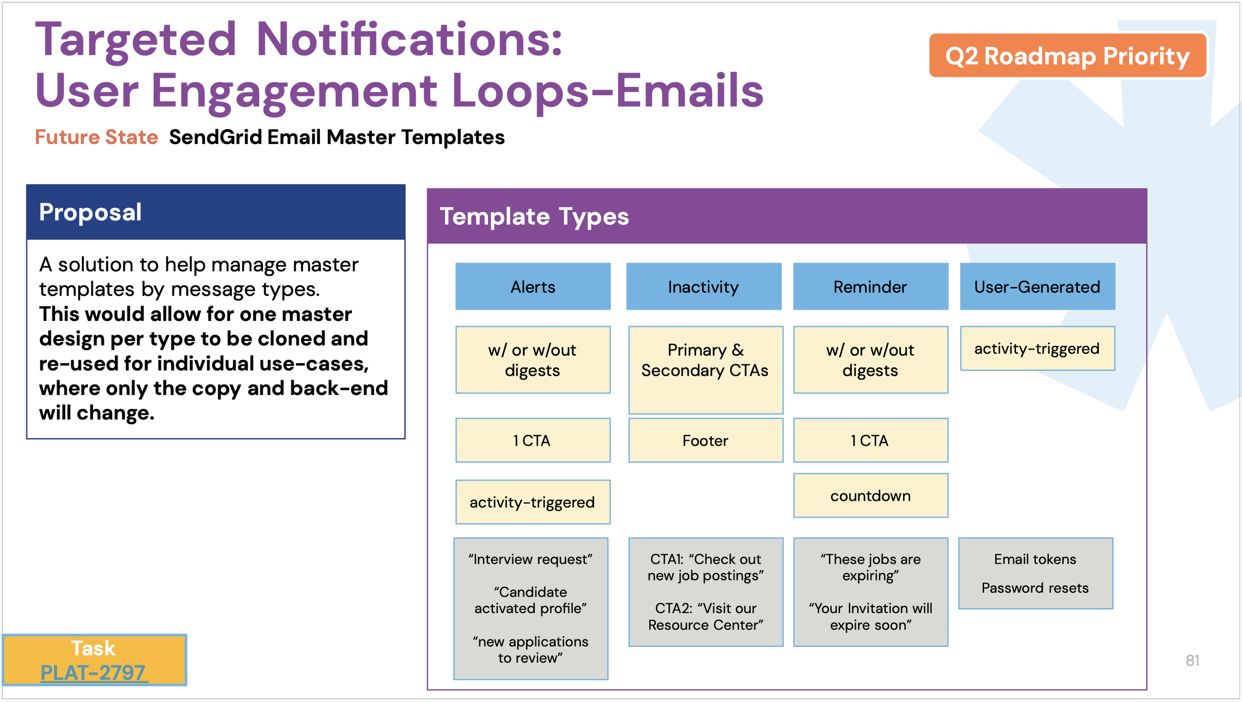
As solutions were being formulated, the flag was raised that we should also build the email templates in a way that allows developers to manage them easier. Working with the product manager and devs, we came to a conclusion that categorizing the emails into four main types would mean that we only needed to make four email templates, that the 37 current email designs would follow. I also suggested developers route them from one main template, so that if we make a change to font/color etc, it would make the change globally, which is how I set it up in Figma.
Now that the scope creep work was completed I created high fidelity designs that went through a few iterations while working closely with marketing.
Not visually appealing - Added bold color contrast that matches brand guidelines
Design inconsistencies - Followed brand guidelines and created template styles for consistency
Has no clear call to action until reaching the bottom of the email - Added large prominent subject text with a call to action button at top and bottom-to also mitigate having to scroll back to top or bottom for actions
Doesn’t align with Stellarworx brand guide - IT DOES NOW! lol
Many of the actual emails do not provide value - An example is the inactivity after x period of time email, I changed this email to add either “new jobs” or “new candidates” that match the user’s search criteria, to add value for them to return to the platform.
Solutions
Developer Hand-off
When passing off designs to developers, I usually attach a prototype, and a design specification sheet, as pictured below, to minimize any discrepancies from design to production.


